Why is UX more than just button placement?
A product that works is nothing without its users. To maintain their interest and remain attractive, it must absolutely offer a simple and adapted experience. It is for this reason that all innovative project launchers want to have a good “UX” in their application. This choice is perfectly legitimate and strongly encouraged. However, the notion of UX is often only partially known and we are content to consider that an application offers a good user experience if it is easy to navigate from one page to another.
Let’s go into a little more detail about what UX represents and the different ways to improve it during a project.
What is hidden behind the notion of UX?
When buying a smartphone, we always pay attention to certain criteria that are specific to us: battery life, storage capacity, type of package, etc. These criteria are defined thanks to our past experiences as smartphone users. However, our shopping experience is not limited to the use of the purchased product. It also encompasses interactions with in-store sales staff, brand marketing communications and after-sales service. It is all of these small elements that make up the user experience.
User experience, or UX for User eXperience in English, has its origins in ergonomics and the study of the human factor. This discipline aims to understand the interactions between humans and other components of a system, such as a workstation or an everyday object. But what is UX exactly?
Don Norman, one of the stalwarts of the user experience field, first employed this notion in the 1990s. According to him, user experience encompasses all aspects of end-users' interaction with a company, its services and its products. This means that UX is not just limited to digital! Moreover, it implies that you have to think of all the users concerned by the product and not just of a single ideal user. The product must therefore be easy to use and the user must be comfortable with it. Thus, it is important not to forget to respect digital accessibility standards.
Ergonomics: a first basis for designing a good mobile and web experience
Designing the interface of a mobile application or a website is not something that can be done without thinking. You have to have the right reflexes not to reproduce the errors that we often encounter on certain applications or sites that frustrate us. One of the first reflexes to have is to ensure that the interface correctly meets ergonomic criteria. But which ones? Several possibilities are available to us.
Nielsen heuristics: Jakob Nielsen is another very important figure in the world of UX. During the 1990s, this doctor in ergonomics worked a lot on how to improve human-machine interfaces. His studies have enabled him to determine 10 criteria that can detect usability problems of an interface.
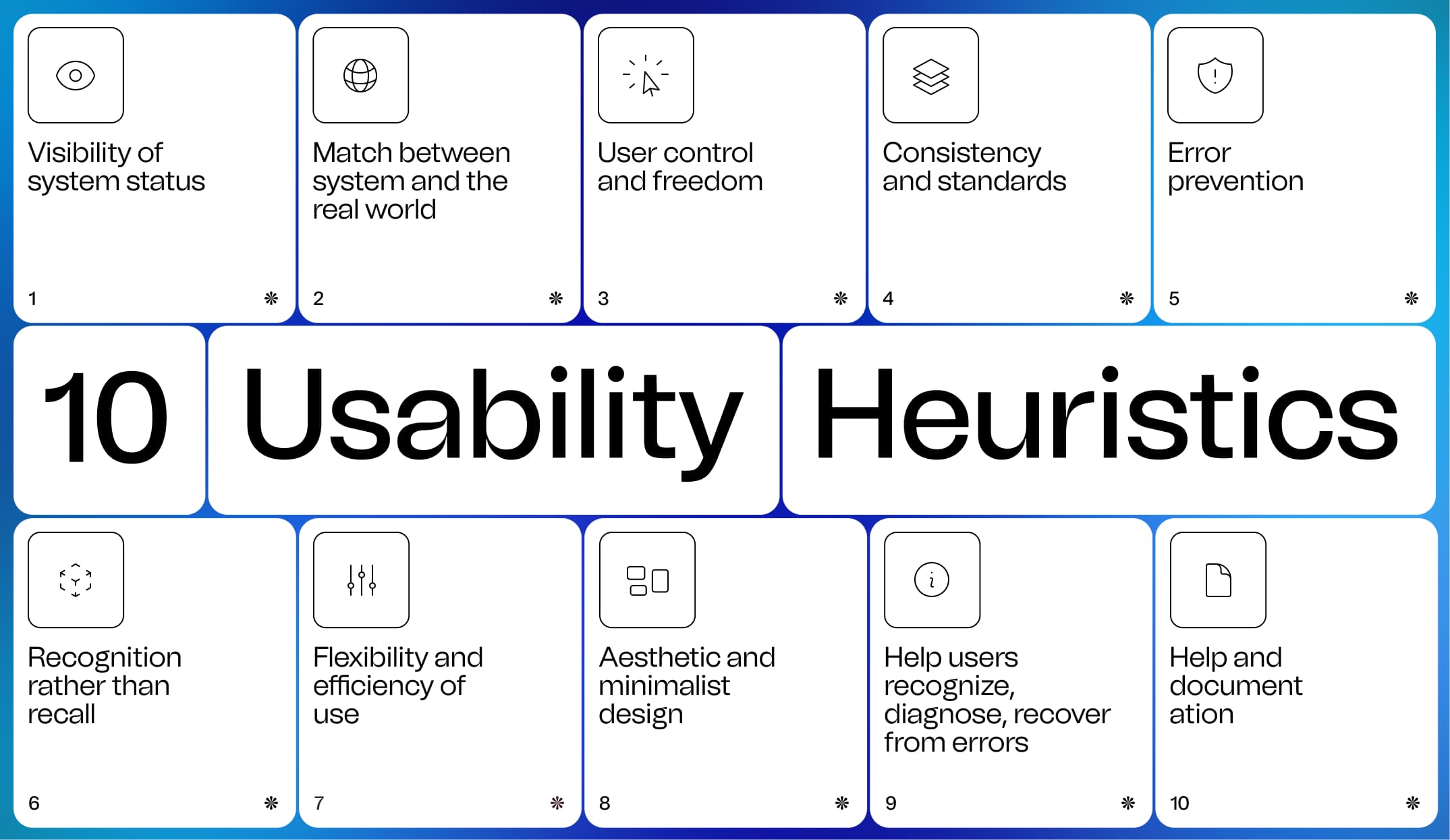
Bastien and Scapin's criteria: Bastien and Scapin, two French researchers in cognitive ergonomics at INRIA, also studied how to evaluate human-machine interfaces during the 1990s. They thus came up with a list of criteria ergonomics applicable both on mobile and on the web.
The revolution in digital interfaces has been going on for several years now, notably with the commoditization of smartphones. It has allowed a continuous evolution of these criteria so that they are still relevant with our uses, and this, more than twenty years later. Be careful though, heuristic evaluations do not derogate from user tests. They are primarily used to correct ergonomic problems based on theoretical principles, while the user experience is based more on the emotions and feelings of users.
Another line of work in interface design is how to display information. There are still many sites on which there is a lot of information and where you do not know where to start to find what you are looking for. It is always very frustrating and we often end up leaving without being satisfied. To allow the user to find what he is looking for quickly and easily, it is therefore necessary to prioritize the information. Many languages read left to right and top to bottom. The first information we see is therefore often displayed at the top of the screen, or in the middle if it is highlighted in relation to the others. It is therefore necessary to play on the size of the elements as well as on their display order to highlight the key actions and important information. For example, on an e-commerce application, we will often tend to highlight photos, the name of the item, its price and a purchase button. Of course, the order in which information is displayed must be adapted for languages that are read from right to left.
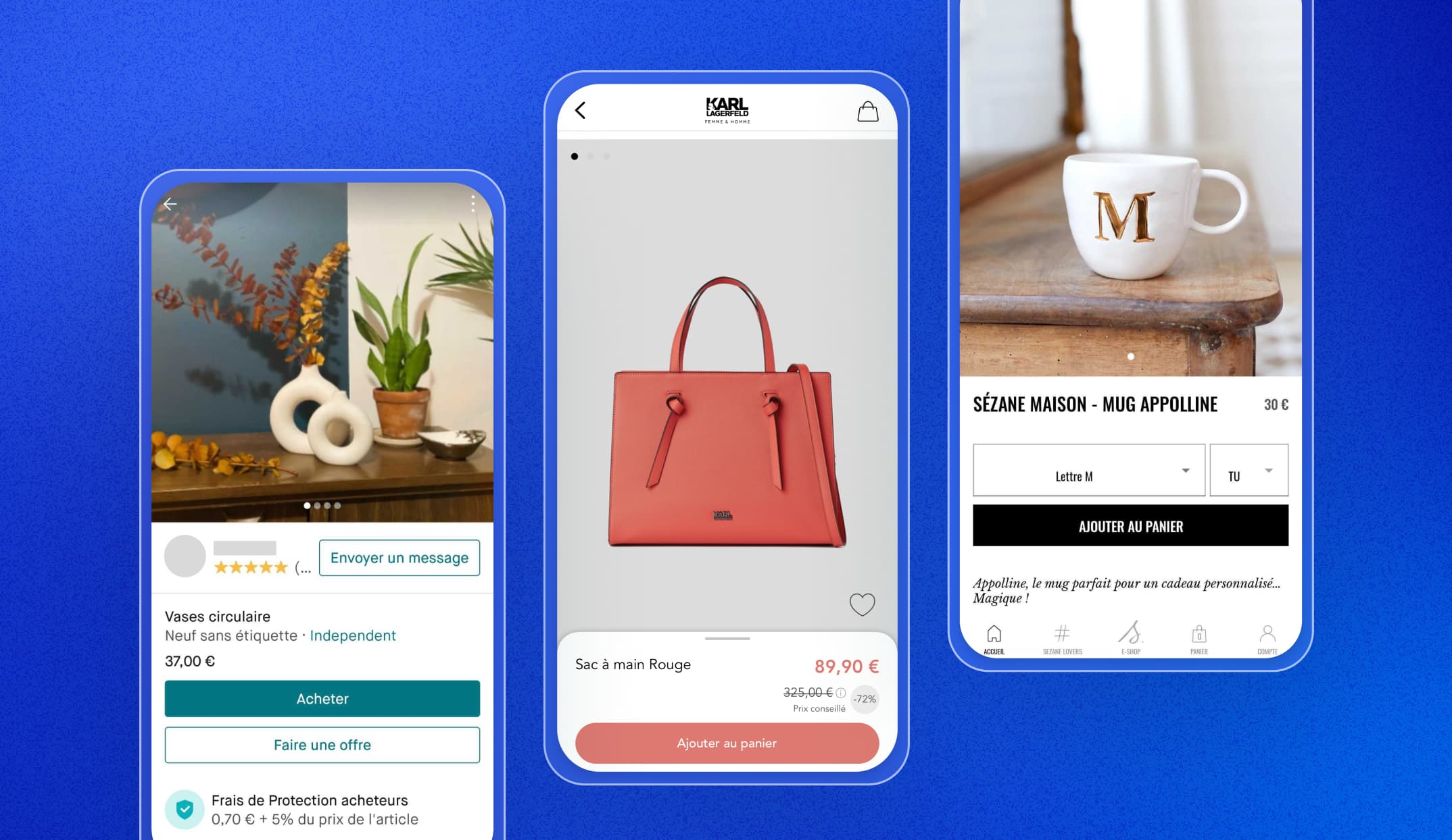
Knowing how to structure information and arrange elements on an interface is a good first step to providing a good user experience, but it is far from enough if the product has not been tested in reality.
UX is not instinctive
Some actions taken by UX designers, researchers and other UX professionals may seem instinctive and arbitrary, but that is not the case at all. They are inspired by the experience they have acquired during their projects and their meetings with users for certain simple subjects. And above all, they regularly test their ideas.
When you are convinced of your idea, the first instinct is to think that you know the users you are targeting well. However, the opinion that we have of it is only based on assumptions and our beliefs. Like a scientist who tries to demonstrate his theory, he must confront his hypotheses by meeting the people who will actually use the product.
We are easily biased when developing a product because we are immersed in its design on a daily basis. However, these are not the conditions under which the product will be used by end users. On the contrary, the latter will discover the product without having any prior information. Fortunately, being aware of this bias allows us to take a step back and adopt an approach to detach ourselves from it. This is where user-centered design comes into its own.
Some methods to confront users
Many methods that are practiced with users exist to understand their needs and agree on the right direction of the product. They do not meet the same goal as methods without users, so it is important to clearly clarify your objectives before going to meet users to choose the appropriate method. Here are a few :
1. Interview (or semi-structured interview)
We recommend using this method at the start of the project because it is very useful for understanding the context of users and gathering their needs. It consists of asking very broad questions to understand the expectations of users and their fears. You have to be careful about the wording of the questions so as not to guide the answers, so open questions are to be preferred (which cannot be answered with yes or no).
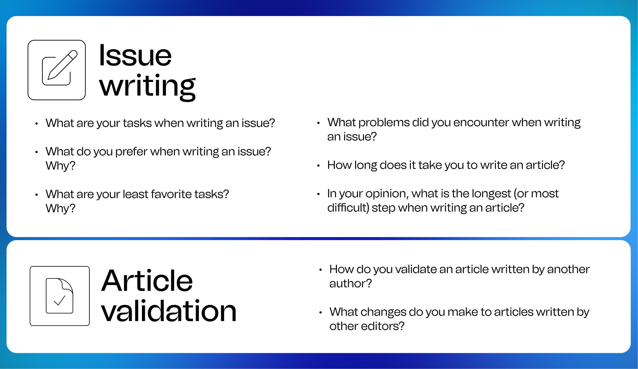
In addition, the user must be given time to express themselves in order to miss as little information as possible that could prove useful. Nevertheless, the users interviewed must have varied profiles while corresponding to the intended target for the product. It is of course possible to interview people who do not quite belong to the target to possibly define new potential targets.
The data collected through this method is qualitative, so their analysis will take time. Indeed, it is not enough to note everything that users think they need, but it is also necessary to analyze their comments to distinguish their expectations from the actual use of the product they will have.
2. Open card sorting
Card sorting is very useful for defining a tree structure and how to navigate an interface. This method consists of preparing cards upstream, each representing a feature or content of the application. The user must then sort and group them by giving them a name and explaining their choice. This categorization is done according to his own understanding of the cards. He will therefore define the tree structure that seems the most logical to him! This exercise is very effective for understanding the way users think and learning their vocabulary.
The results of the workshop must then be compared between the different users to arrive at a categorization of the content that will correspond to the mental model of the users. The resulting analysis is quantitative. For example, we can count the number of times cards have been grouped together and associate a similarity score to it to define a matrix with all the content. This will lead to categories corresponding to groups of themes frequently gathered by users, and therefore the tree structure of our product.

3. User testing
This is THE essential method in UX since it allows direct comparison of design a priori with user usage. It really shows that the placement of buttons and texts on a screen is not enough to know if the user is really comfortable with the product. Indeed, user testing reveals the main usability problems. They consist of observing user interactions in the most natural context of use possible. The advantage of these tests is that they can be carried out at any time during a project: on a paper or cardboard model representing the product, on an interactive prototype before the start of development, on an intermediate version or once development completed. At BeTomorrow, we recommend organizing user tests after at least 3 sprints (6 weeks). This objective allows teams to focus their effort to deliver maximum value for testing.

Before setting up tests, you must first define what you want to test
in the product. This allows us to define an observation grid to collect the results during the test. It will then be necessary to determine scenarios to test different tasks on the product. These scenarios should also not tell the user exactly how to do it, but rather give him a goal to achieve. For example, he will be asked to buy a product rather than going to the checkout page. In any case, the testers must be encouraged to say everything they think and feel during the test so as not to miss any key information. This will allow us to observe how they really use the product and to collect verbatim on their feelings. It is for this reason that as an observer and facilitator of the test, you must remain neutral so as not to guide the person in their actions.
The analysis of the information collected will make it possible to highlight the main points of friction on the interface and thus lead to recommendations for improvement for the product. In addition, it is an opportunity to be reassured about the acceptance of the product by its users and to validate certain assertions.
Traps to avoid
You still have to be careful when doing UX not to fall into the trap of considering all the elements brought up by users as they are. Indeed, some user feedback is not always good to take into account, it is necessary to make a selection among them and then redo the tests to see if they are really shared by others. In addition, it must be borne in mind that the need expressed by users is often different from their real need. Asking a person about their ideal experience will be of little interest because their answer will always be too far away. Conversely, if we ask her to tell us about the last time she carried out the action, this will bring out much more concrete issues. It is therefore important to reflect on each of the returns and to prioritize the most frequent ones. However, exchanges with users are always valuable since they are rich in information and allow you to take a step back from your product. They are also a good opportunity to have positive opinions on the fact that our product is appreciated at its fair value!
Finally, it is good to know that we are all, as human beings, influenced by many cognitive biases when making our decisions. These biases influence the work of the UX designer / researcher and their perception of their users. The same goes for our users, so it is important to be aware of them and anticipate them as much as possible to be able to avoid them.


